Alone in the Corner
For a long time I - as many people - was under the impression that goals from corners are largely due to randomness. Whenever my team conceded a goal from a corner I would lament the recurrent luck of the opposing team, and wish that luck could just once go our way.
Enter FC Midtjylland and Ted Knutson’s piece on set pieces. Now there was a team absolutely smashing it on set pieces. Not only did they score heaps on corners and free kicks, they also scored tons from throw-ins. Yeah, that’s right. Goddamn throw-Ins. And there was Ted, one of the household names in football analytics having played a decisive role in devising Midtjylland’s set piece program, claiming it is all trainable.
Add to that, there are teams - even good ones! - like Athletico Madrid that have been strong at set pieces over the years and your view of your team just being unlucky is gravely challenged. It’s not that we were unlucky. No, we probably did not spend enough time on training set pieces, and consequenly sucked at them.
Here I was, deprived of my defense mechanism that let me externalize my frustration at goddess Fortuna. Alone in the corner, which probably felt as bad as losing on a rainy day in Stoke.
You could say that this was my motivation to take a detailed look into corners. But though I am sorry to smash that view, actually it was just inspired by a visualization from @FutbolAvancado that broke down corner delivery frequencies into short, near and far post, and Statsbomb’s available free dataset, that allowed me to build and hopefully improve on that, by introducing some more detail.
There is also prior research on set pieces available. Most prominently Paul Power et al. from STATS have taken a detailed look at scoring rates from set pieces - including in- vs outswinging corners, direct shots vs flick-ons and shots from second balls, and also analyzed the impact of how a corner is defended - zonal vs man-marking and hybrid schemes, as well as men on the posts. If you are deeply interested in this topic, definitely go read the paper.
I will look to replicate a few of his mythbusting findings, have a detailed look at some numbers and develop a few visualizations that help in
a) categorizing delivery schemes and target zones
b) analyzing how often a corner connects to teammates, leads to shots, and how valuable those shots are
c) differentiating between direct shots, shots from flick-ons / further passes (indirect shots) and shots from rebounds (<= 8s after a previous shot was taken) and shots from regains (>8s after last shot), and shots from counters faced.
d) analyzing rebounds and second ball regains.
In this first piece I will introduce a first visualization that is aimed at better understanding corner deliveries and outline my process of developing it. The rest of the topics will be split up into a to be determined number of articles that have yet to be written.
Corner Delivery Zones
The first question when analyzing corner deliveries is where are corners being delivered? When talking about that, it is usual to differentiate into short corners and corners facing either the near or the far post. That is exactly what @FutbolAvancado did and visualized beautifully:
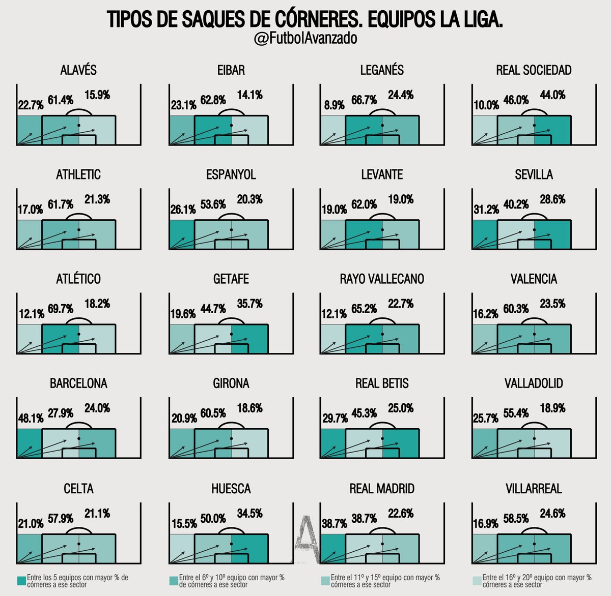
It is a very clear visualization that you can make sense of immediately.
Colors stand for the ranks within a delivery zone - devided into the top 5, 6th-10th, 11th to 15th and 16th-20th teams respectively.
The annotated percentiles clearly state the delivery frequencies. I love that visualization.
Still I wondered, can we do better?
The main qualm I have with this visualization is, it could be more detailed.
We can agree on that there is a huge difference between making a delivery right in front of goal vs between the six yard box and penalty spot, right?
So I definitely wanted to try to divide the delivery zones up further along the vertical direction. Additionally, it also makes sense to differentiate further along the horizontal axis as a delivery right in front of goal is different from one short of the near post.
The thing one would have to be careful about though is dividing the box into too many zones as that would introduce too much complexity.
Additionally, I had recently written an article on Non-Negative Matrix Factorization, which allows us to find patterns in spatial data. To apply this algorithm we apply a two-dimensional binning to split up all corner delivery targets into zones for each team. The algorithm then learns n spatial components comprised of weights from all the bins and weights for each team which state how much a team uses a given spatial component.
The benefits of this are that this reduces the complexity back into a managable size and allows us to find patterns inherit in the data. I described it in a little more detail in my article here if you are interested:
Applying a 2x2 yard binning with n = 5, gave me the following spatial components:
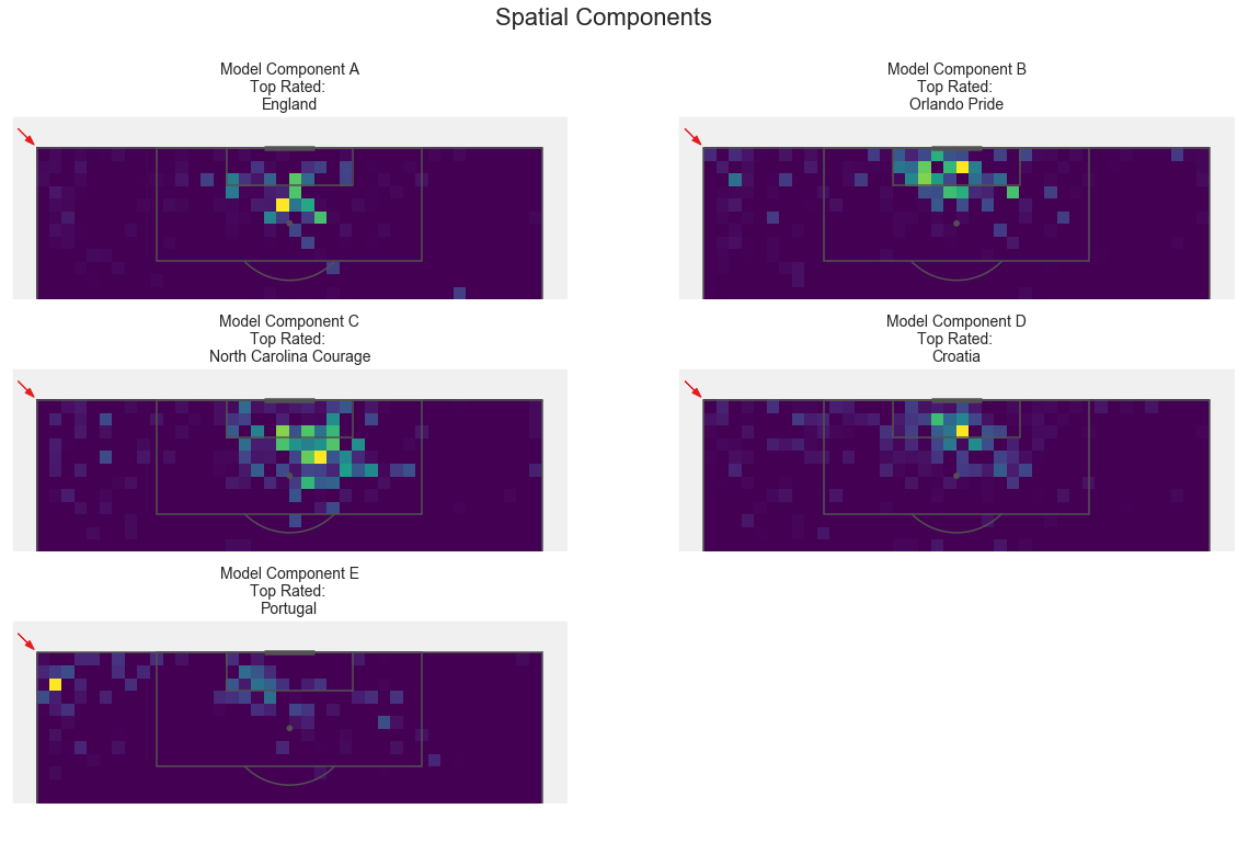
We can clearly see the spatial patterns this picked up and make sense of different delivery zones:
A: mostly very central, from the edge of the 6 yard box to the penalty spot.
England is the team that most used this component. That makes a lot of sense.
B: This component focuses on the zone right in front of goal, mostly towards the near post. It stretches out a little vertically, but mostly just to barely outside the 6 yard box.
This is what I would expect for teams choosing an inswinging delivery.
C: Now we see a clustering around the far post, probably centered just beyond it, with a little weighting showing up in front of the near post. It also stretches beyond the penalty spot.
This actually makes a ton of sense for outswinging corners: Some will be cleared beneath the near post, connection is intended in front of the goal below the 6y box and towards the far post.
D: When you look at this component, you see it centered in front of the goal, losing weight in an outswinging direction.
Again, this kind of captures an outswinging corner routine very well.
This shows a little problem in that components can overlap and don’t seperate too well.
E: That’s easy. Emphasis on short corners.
We do get some other weights though, which again shows the problem that some corners are not seperated enough. But this will arise, as hardly any teams will only take short corners.
Looking at this again after a little time and a little more detailed look into in- and outswinging corners makes me want to rerun this for n=4 to see whether the two outswinging routines would combine.
You may now wonder, but if bins will have weights in mutliple spatial components, how do we assign a corner to a spatial component? Using the zone of connection will clearly not work.
So what I looked into was assigning each corner to the spatial component that had the most weight in the connection zone and passed a threshold.
This may not be very rigid - honestly I don’t know. I’d we interested in hearing your thoughts and comments. The 6th is the 5 model components combined into one plot.
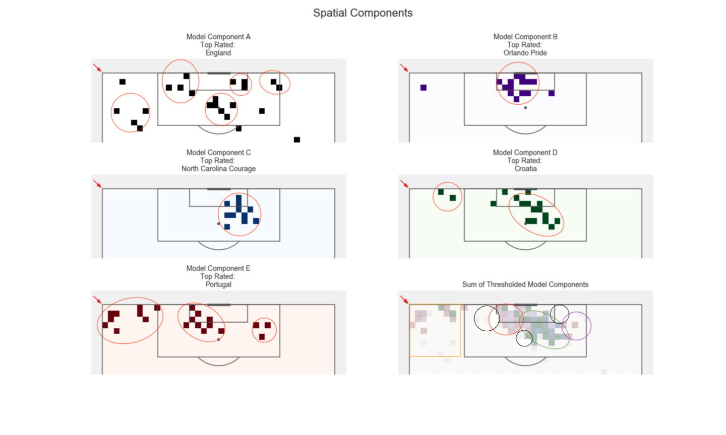
So this only has bins showing up in at most one of the components. Still I wasn’t very happy with this, as it is just very very messy.
I then tried using bigger bin sizes. 6x6 yard bins actually seperated components rather well, so I ended up choosing to divide the delivery zones based on what using this bin sizing gives us:
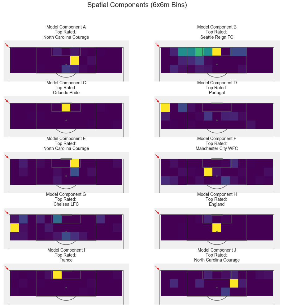
Reconsidering this now that I am writing this up, I may well have made some different decisions dividing the bins.
Before touching on these points I will first show you how I chose to divide the bins though:
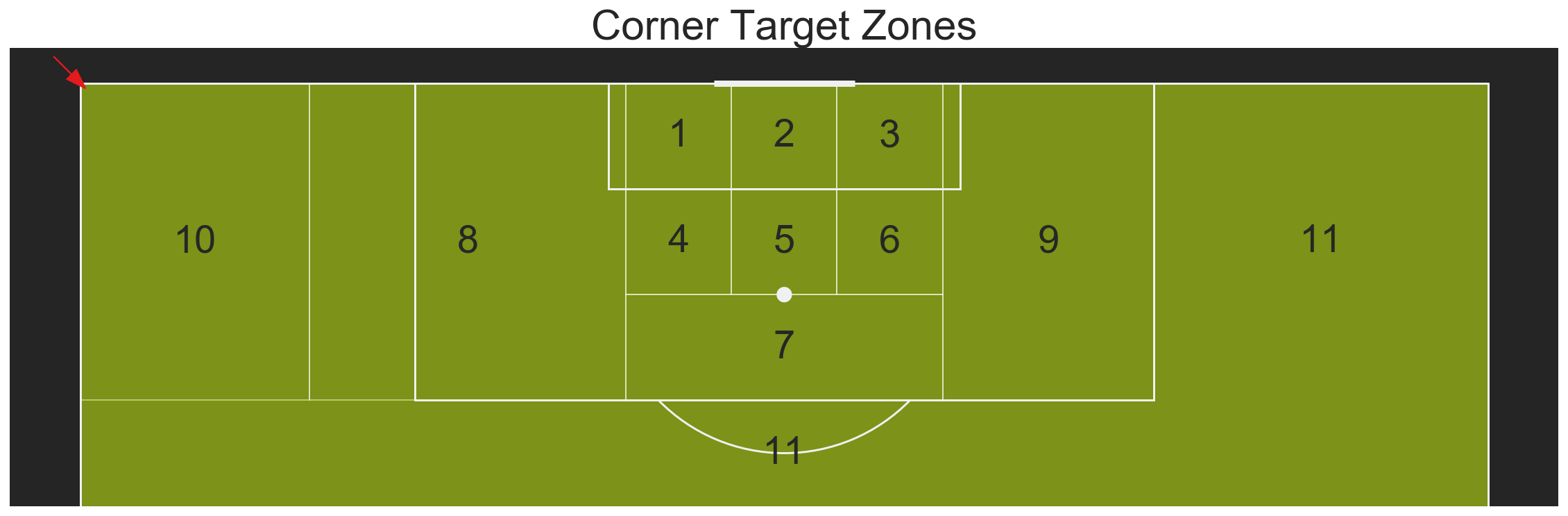
added note: This is actually quite similar to how Craig Pulling (also based on prior work) divided delivery zones in his Paper LONG CORNER KICKS IN THE ENGLISH PREMIER LEAGUE: DELIVERIES INTO THE GOAL AREA AND CRITICAL AREA.
So what may I have decided differently?
For one thing, I may have decided to have zone 10 reach up to the box, which would make the whole plot much more symmetrical. I didn’t because component 2 shows heavy weights for this zone.
I also could have let zone 10 reach out backwards in the vertical direction, as some short corners may actually get played backwards that much? I think I will change this, but it will probably not make a difference.
So here we are, if you got that far.
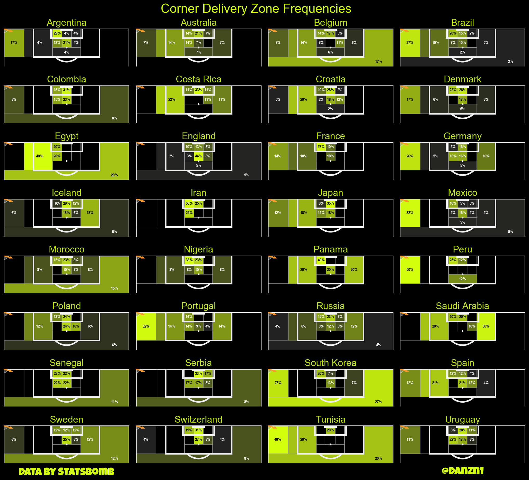
This part actually got longer than I anticipated. To reward you, here is the visualization that I ultimately ended up creating to show each teams corner delivery zone frequencies from the World Cup (All Corners transformed to be from the left):
(Design heavily influenced by @FB_Whispers - Check out their super polished content.)
The next time you will get some more beautiful visualizations, including some corner delivery curves, as well as some actual analysis.
Until then, hit the new year swinging.